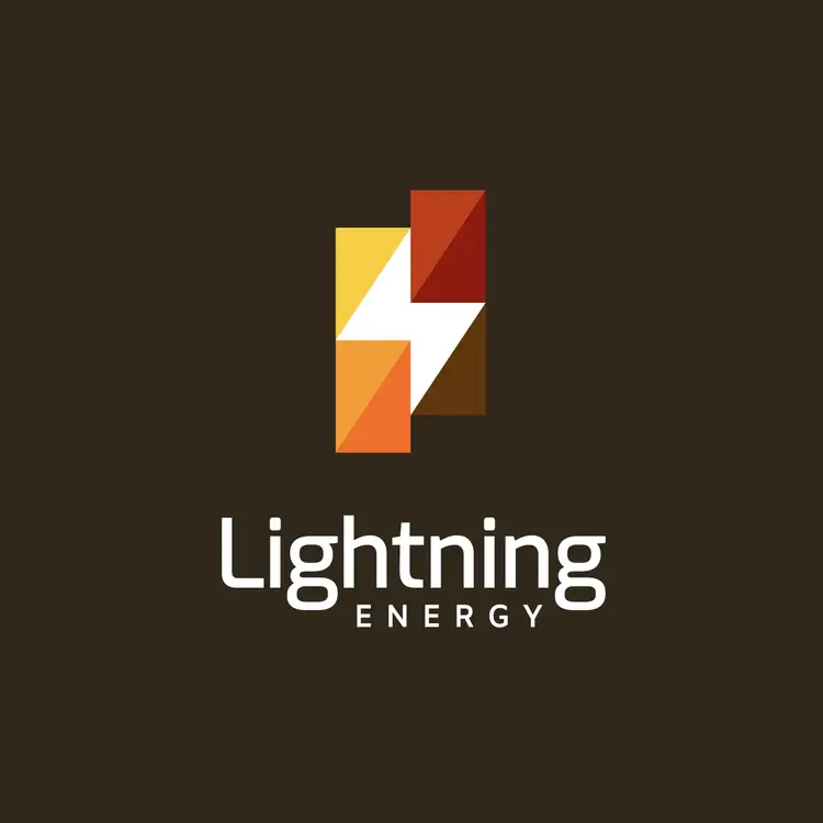
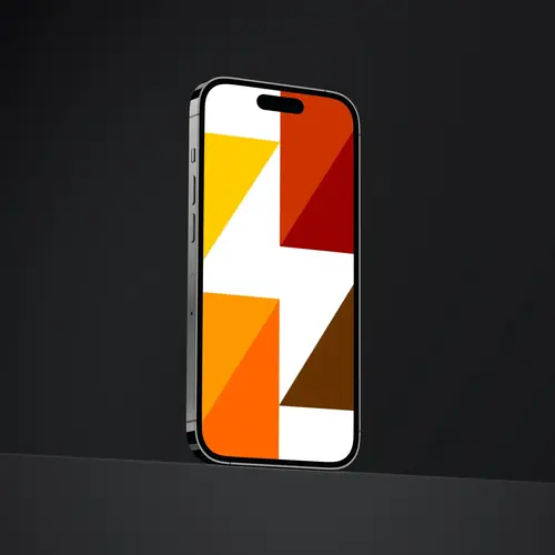
Abstract Energy Logo
Create your professional-quality boutique logo with this highly versatile symbolic design that fits any brand name. Edit colors and text in seconds.

Create your logo
PRO
License:
Single, non-exclusive logo (used in unlimited ways) more info in Logo License
Editable versions:
Free version: PNG files
Premium version: PNG and SVG files
By completing the following form, you can request the edition of the logo with its colors and brand name. You can also request slight modifications to the design. And you will receive the edited logo within 48 business hours.
More about logo editing service
Logo files:
PNG (high definition)
SVG (vectors)
PDF (micro style guide).

Design by
Mauro Bertolino


Ratings
Share
If you like this logo, share it on your networks and help us grow. 😉
Abstract Energy Logo Design Concept
This energy logo is characterized by having an abstract and modern design. Made up of triangles of warm colors that shape a white lightning to generate contrast.
It is a simple concept, but very clever, that demonstrates how with some triangles it is possible to generate shapes in negative spaces.
And they give that abstract look to the design. Which is an excellent option for those who need to generate an energy logo with a modern and colorful style.
Ads
Possible uses of this abstract energy logo
We associate this logo with the energy industry because the main element that makes it up is lightning. But it is possible to use it in other industries or specific niches.
It would work great for renewable energy companies, oil companies, and electric energy companies. But as we said before, it can be used in other niches or industries if the design manages to connect with the products and services offered by that business.
Ads
Edit and customize your abstract energy logo
This is a logo that can be somewhat difficult to edit, despite being a simple concept. Because you have to get a good harmony in the colors. If you notice, we have used a set of warm colors. So, you have to maintain that relationship with the colors.
If you need to use colder colors, the ideal would be to use light blue and light blue colors. To achieve a good visual harmony. And when you edit the text, it’s a good idea to stick with the same font or a sans serif. Since this type of font is 100% compatible with the design.
Ads
Appearance
Style
Published
Related and similar logos
Here you have similar logos that you can also edit.
If you could not find the design you are looking for, you can go to the “Home” page, or you can email us, and we will create the logo you need.


